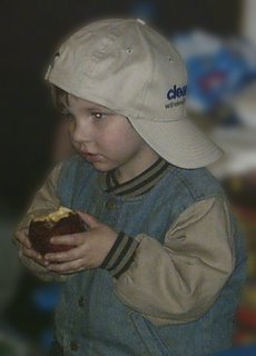
The first has the back ground blurred a little bit.
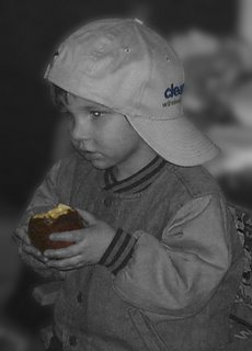
 The second is Black and White with the apple the only touch of color. The color of the apple is too dark though and I can't seem to be able to fix it.
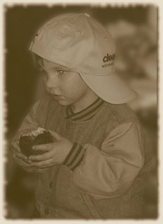
The third has an old photo treatment done to it, sepia toned, softened a little, blurred edges, and rounded corners. You don't see the rounded corners very well except for the lower right corner.

2 comments:
I like the sepia toning best - you're right about the apple being a bit dark on the first one - makes it look a little unnatural and unappetising. Have you tried using the dodge/burn brush thingumy? Set it to about 3%, wave it over that area and see if it helps!
Alternatively, you can select the apple as if you were doing a cutout and then adjust brightness and/or hue/saturation... could be worth a try :)
Thanks, I'll try that. I agree that the sepia toned one is the best. The original reminded me of photos of family from the early 1900's so I thought it would work well with an old fashioned kind of treatment.
Post a Comment